Mapping the impact of COVID-19 on electricity demand
Victoria is experiencing a ’second wave’ of COVID-19 cases not currently being seen in other states. Consequently, Melbourne is once again in Stage 3 lockdown.
One thing that Victoria also has that other states don’t is quality electricity consumption (demand) data, due to more than 99 per cent of premises having Advanced Metering Infrastructure (AMI). As a result, changes to the community’s patterns in consumption can be easily seen and understood.
We have shared the Victorian consumption (demand) data throughout the pandemic and also have shared the changes in electricity demand internationally.
While Australia has experienced significant changes in demand, total consumption has only dropped by two per cent in Victoria. This is in comparison to Europe, where demand fell by up to as much as 30-40 per cent.
This article explores the Victorian data in map form and illustrates how the impact of the restrictions has changed on a postcode-by-postcode basis throughout April to June this year. Each of the areas on the map represents the essential hub in each local area that delivers electricity to consumers.
The maps are split into three segments: 1) residential, 2) small-medium enterprises (SMEs) and 3) large businesses.
The consumption for a given month in 2020 is compared with the consumption in the same month in 2019.
As one of the biggest drivers of consumption is heating and cooling of homes and businesses, consumption is significantly impacted by weather. At this stage, the data has not been normalised to account for weather conditions, although this has been explored in results. The green-blue-purple colours represent increases in consumption, versus the “hotter” yellow-orange-red colours, which represent decreases in consumption—the more intense the colour, the bigger the change between 2019 and 2020.
Total consumption, combining all three consumer types, ranged from reductions of up to 50 per cent to increases just under 50 per cent. While Victorian consumption state-wide is down, only one-third of the postcode areas experienced a decline. This effect is driven by six key suburbs, such as the Melbourne CBD, which normally have very high consumption, but are now showing a significant reduction.
Residential demand
Residential consumption in Q2 2020 is about 20 per cent higher on average than the same period last year, due to a combination of COVID-19 and lower temperatures.
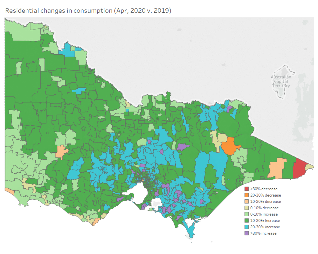
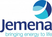
Figure 1: Changes in residential consumption in April 2020 (versus April 2019)
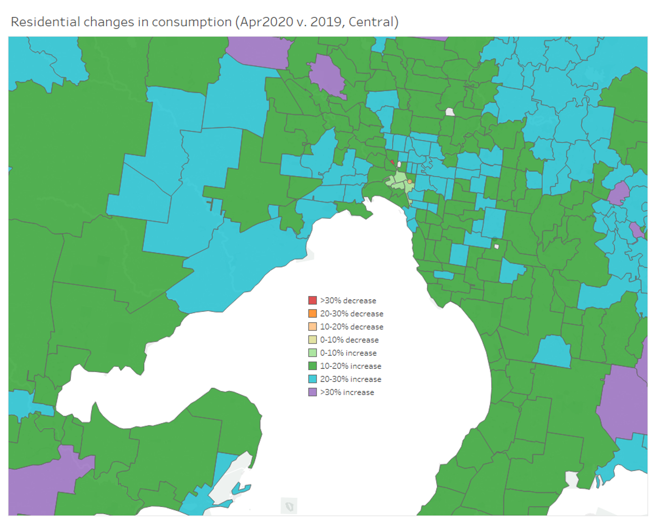
Figure 2: Changes in residential consumption in Greater Melbourne in April 2020 (versus April 2019)
In April, residential demand increased about 20 per cent, but by June, even with the colder winter temperatures, demand showed only a 10 per cent increase over the previous year.
As we zoom in on Melbourne, the increase in demand is more obvious (more blue). In the suburbs of Melbourne, increases in residential demand were about 20 per cent. But at the heart of Melbourne, in the CBD, residential demand increased by less.
At the state level, the areas affected by the summer’s bushfires – Bright and Gippsland – have clearly experienced significant decreases in demand compared with 2019 (red and orange). The decrease in consumption here is, sadly, largely because homes were destroyed by fire and people have had to move away.
Business Demand
Business consumption in Q2 2020 is about 10-15 per cent lower on average than the same period last year, largely due to COVID-19.
In April, SME demand was reduced by more than 30 per cent in some locations, particularly in the CBD as working from home became the new normal.
Figure 3: Changes in SME consumption in April 2020 (versus April 2019)
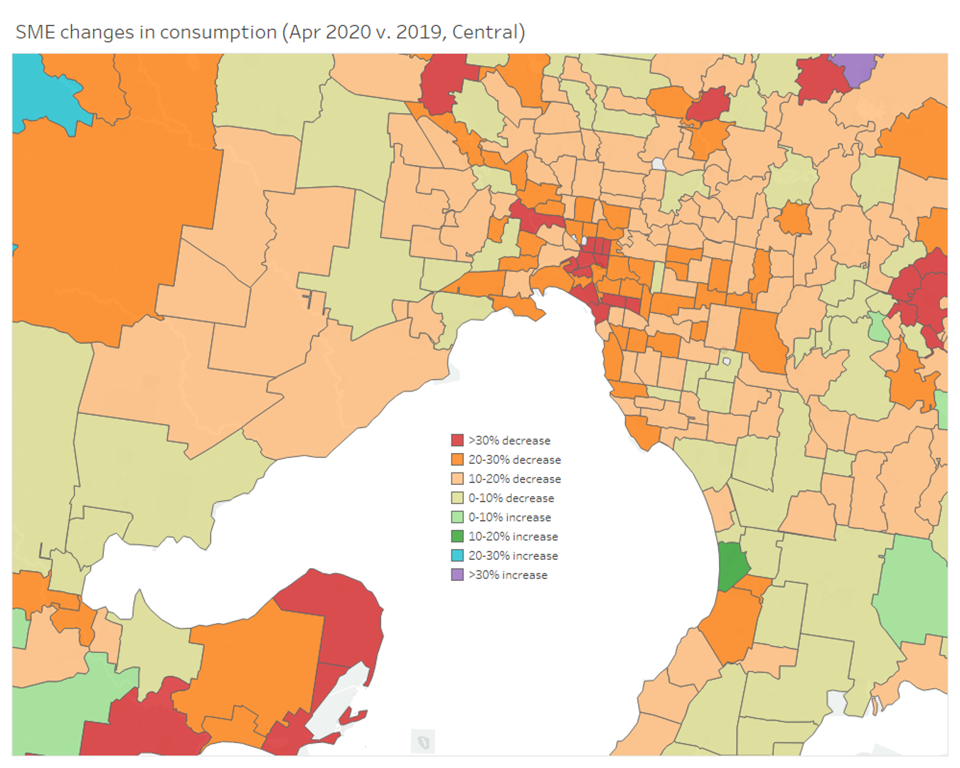
Figure 4: Changes in SME consumption in April 2020 (versus April 2019)
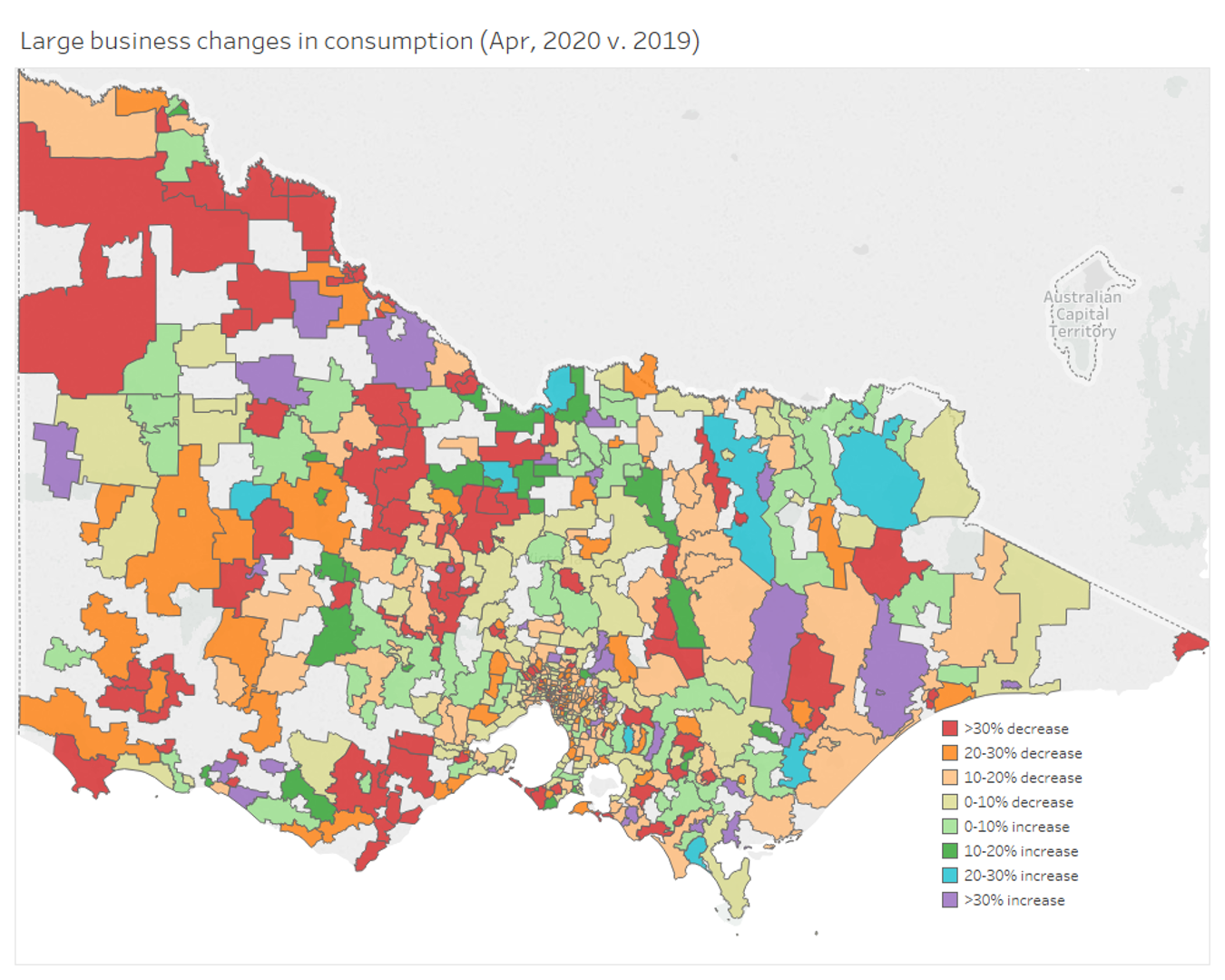
Figure 5: Changes in Large Business consumption in April 2020 (versus April 2019)
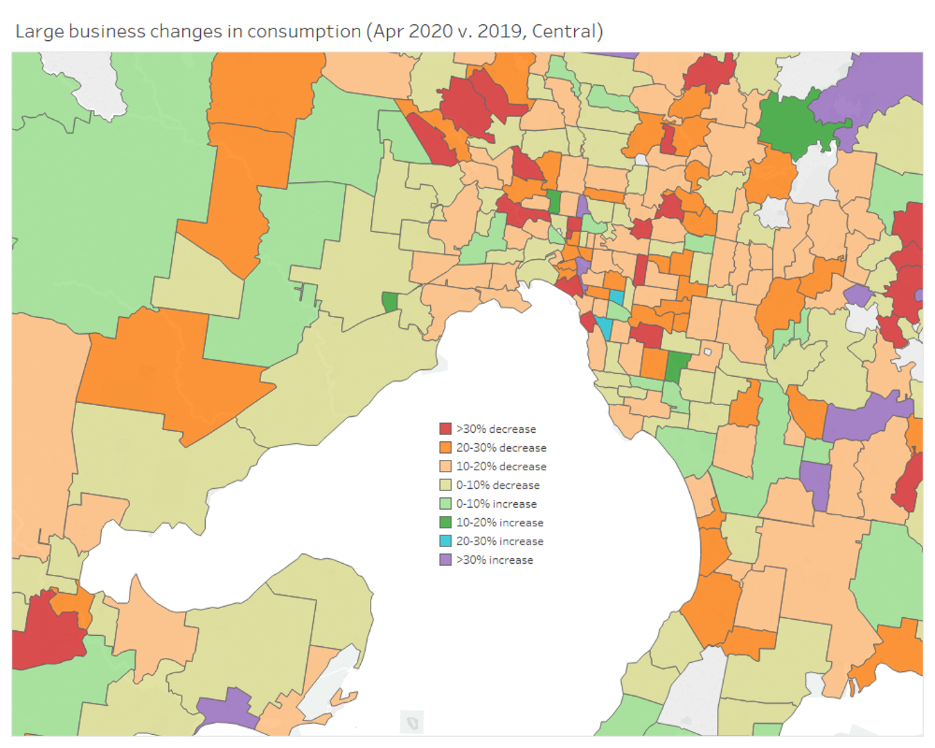
Figure 6: Changes in Large Business consumption in April 2020 (versus April 2019)
The change in demand for large business also reduced, but in some areas increased. Large businesses overall showed slightly less impact than SMEs.
Total consumption
Overall in Victoria, total consumption, combining residential, SME and large business demand, was down by two per cent, which is not a significant difference given typical variations related to weather and other events. But as we can see, that small decrease in consumption, overall, masks very big changes, negative and positive in demand, for each consumer type.
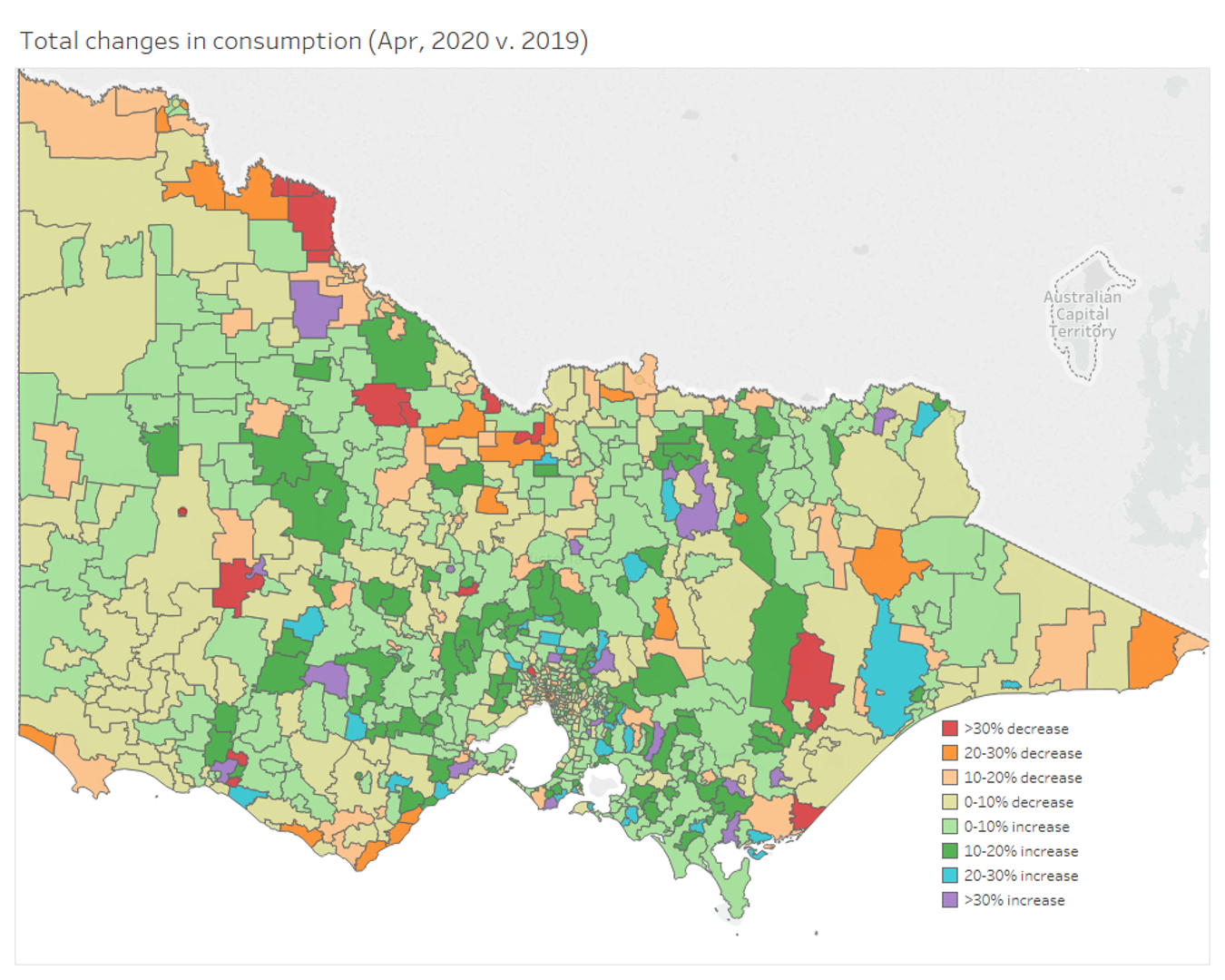
Figure 7: Changes in total consumption in April 2020 (compared to April 2019)
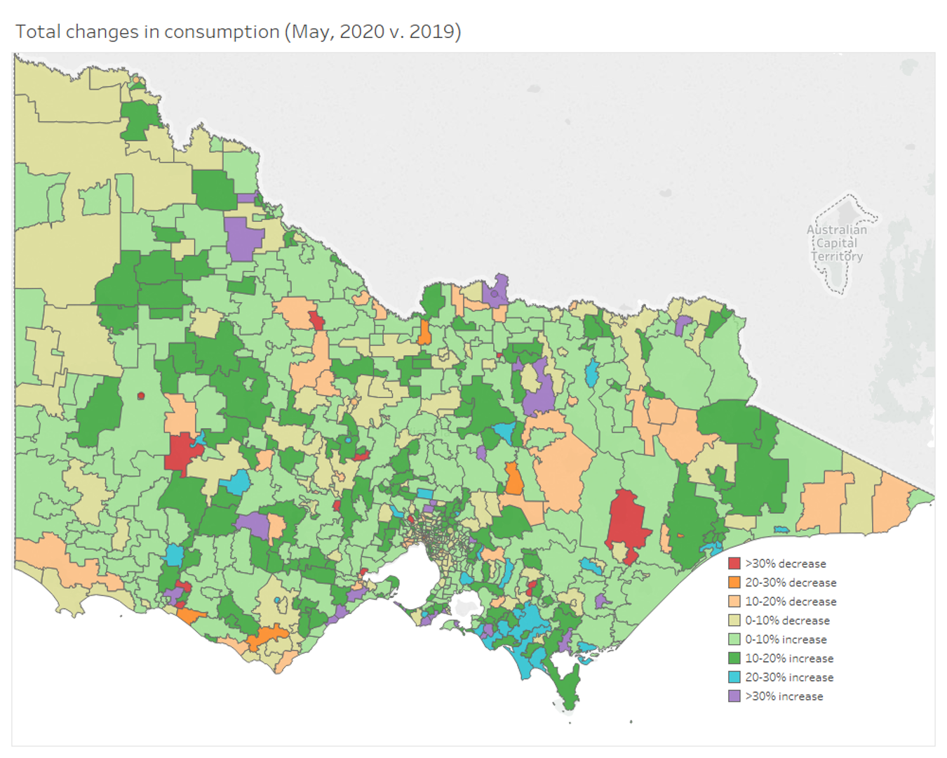
Figure 8: Changes in total consumption in May 2020 (versus May 2019)
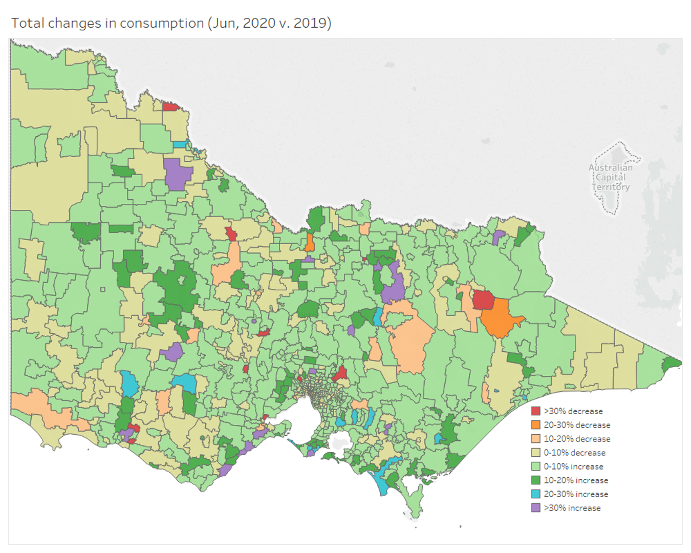
Figure 9: Changes in total consumption in June 2020 (versus June 2019)
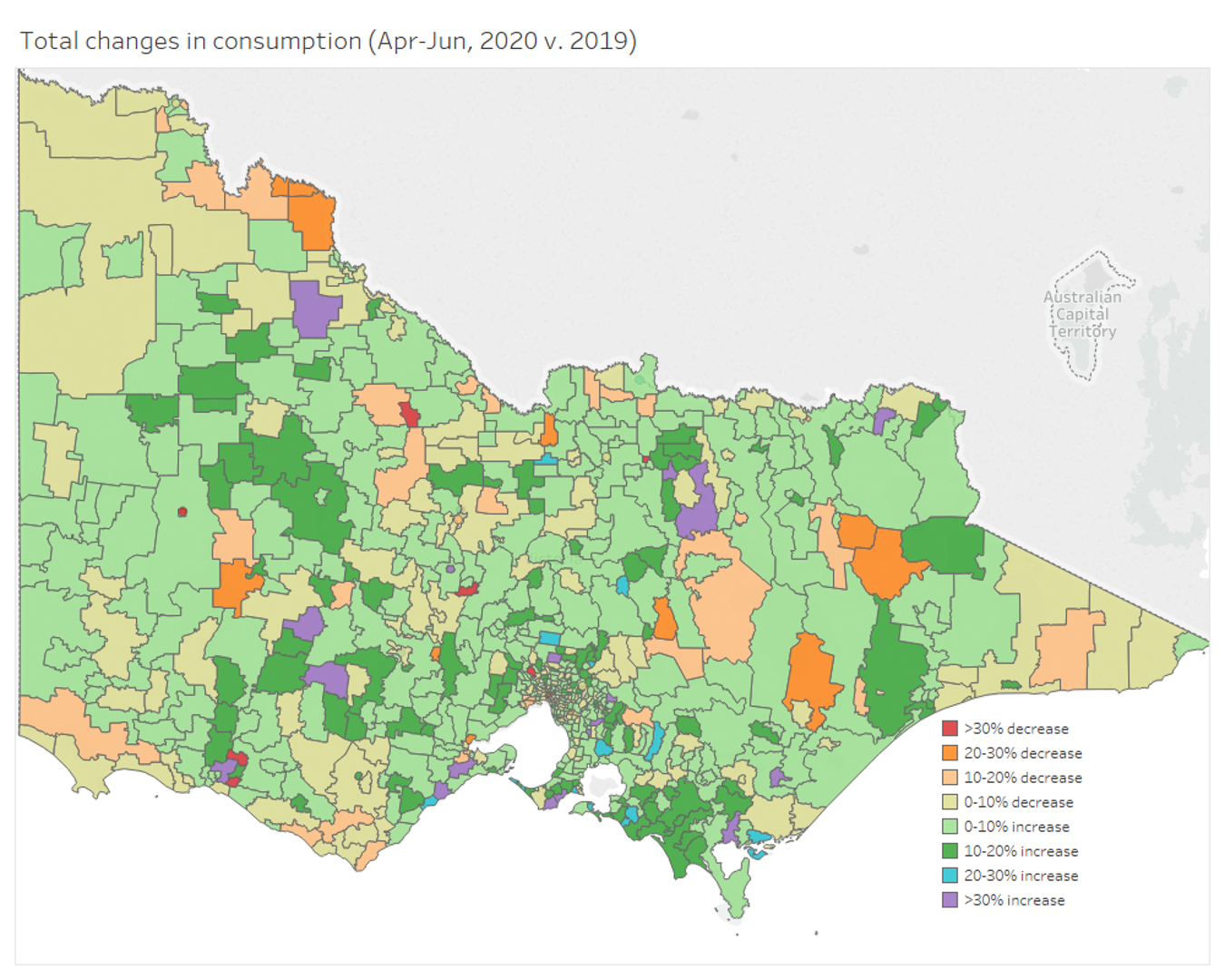
Figure 10: Change in total consumption for Q2 2020 (versus Q2 2019)
The maps for total consumption for April through to June and the combined map for Q2, show how demand in Victoria has changed throughout the pandemic and demonstrates the how significant events, such as bushfires and pandemics change how and where we use electricity.
The maps from April to June, show how the lifting of restrictions in Victoria changed consumption, but with the reintroduction of Stage 3 restrictions in Greater Melbourne, it will be interesting to see how consumption changes for July and August 2020.
The Distribution Network Service Providers (DNSPs) have used the insights that this compelling data has provided to help direct support to exactly the customers who need it.
For instance, Jemena had about 110,000 customers impacted by the initial “hot zone” lockdowns in Victoria. The data from the smart meters, combined with customer surveys, is allowing Jemena to target and tailor its customer advice in those areas.
By monitoring how demand has changed during the pandemic, with an understanding of demographics and the weather and working with consumer advocacy groups, help can be offered quickly to customers who need it the most.
This is a clear demonstration of one of the many virtues of smart meters and the value of the data they provide in enabling networks to tailor services to customers.
This analysis of consumption is based on raw unaudited data. In some cases, gaps exist, which may cause comparisons of consumption between 2019 and 2020 in smaller postcodes to be less accurate. Again, all the maps and analysis in this article are illustrative and should not be used as a basis for decision making.
Acknowledgements
Energy Networks Australia would like to acknowledge the people at the Victorian DNSPs who have shared their data during the Covid-19 pandemic and who have provided these maps.