Stage 4 locks down electricity demand
Thanks to the ubiquitous smart meters, we’ve been mapping the impact of COVID-19 restrictions on electricity consumption in Victoria throughout the pandemic. So, what has changed in response to the second wave and the stricter rules as part of Stage 3 and 4 restrictions in August?
We have previously explored the Victorian data in maps that illustrate how the impact of the restrictions from April to June 2020 changed electricity consumption.
In July, Stage 3 restrictions were reintroduced, and in August, Stage 4 restrictions were applied to metropolitan Melbourne, adding a strict curfew and only allowing travel within 5 km of home.
The consumption for a given month in 2020 is compared with the consumption in the same month in 2019, with no correction for the influence of weather. The impact of weather can be seen in figure 1, with lower temperatures, particularly in western Victoria.
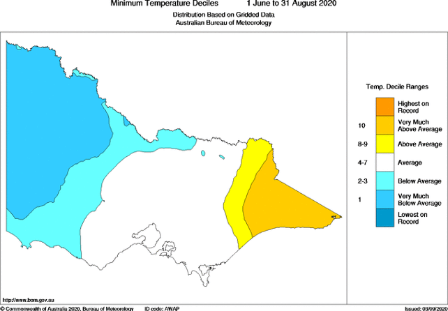
Figure 1: Winter 2020 Minimum Temperature Variation (Bureau of Meteorology)
This can be compared with figure 2 showing residential electricity consumption in Victoria for July. Heating is a significant use of energy, but this data only shows electricity consumption, so where gas is connected and used for heating, this won’t have an impact on electricity consumption.
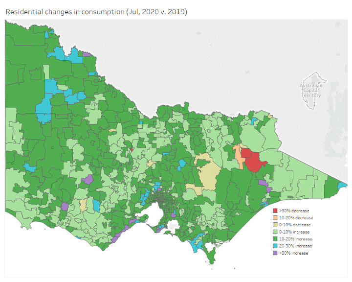
Figure 2: Residential consumption for July
At the state level, residential demand in July increased along some coastal regions, including the Mornington Peninsula and Surf Coast (purple and blue), suggesting some Victorians chose to spend isolation in locations more typically used in summer. Networks are considering what this shift might mean in the future.
In August, the impact on the ski fields can be seen for SMEs in figure 3, where demand decreased by more than 30 per cent.
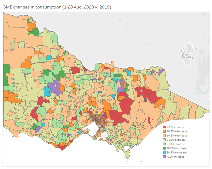
Figure 3: SME Demand in August 2020
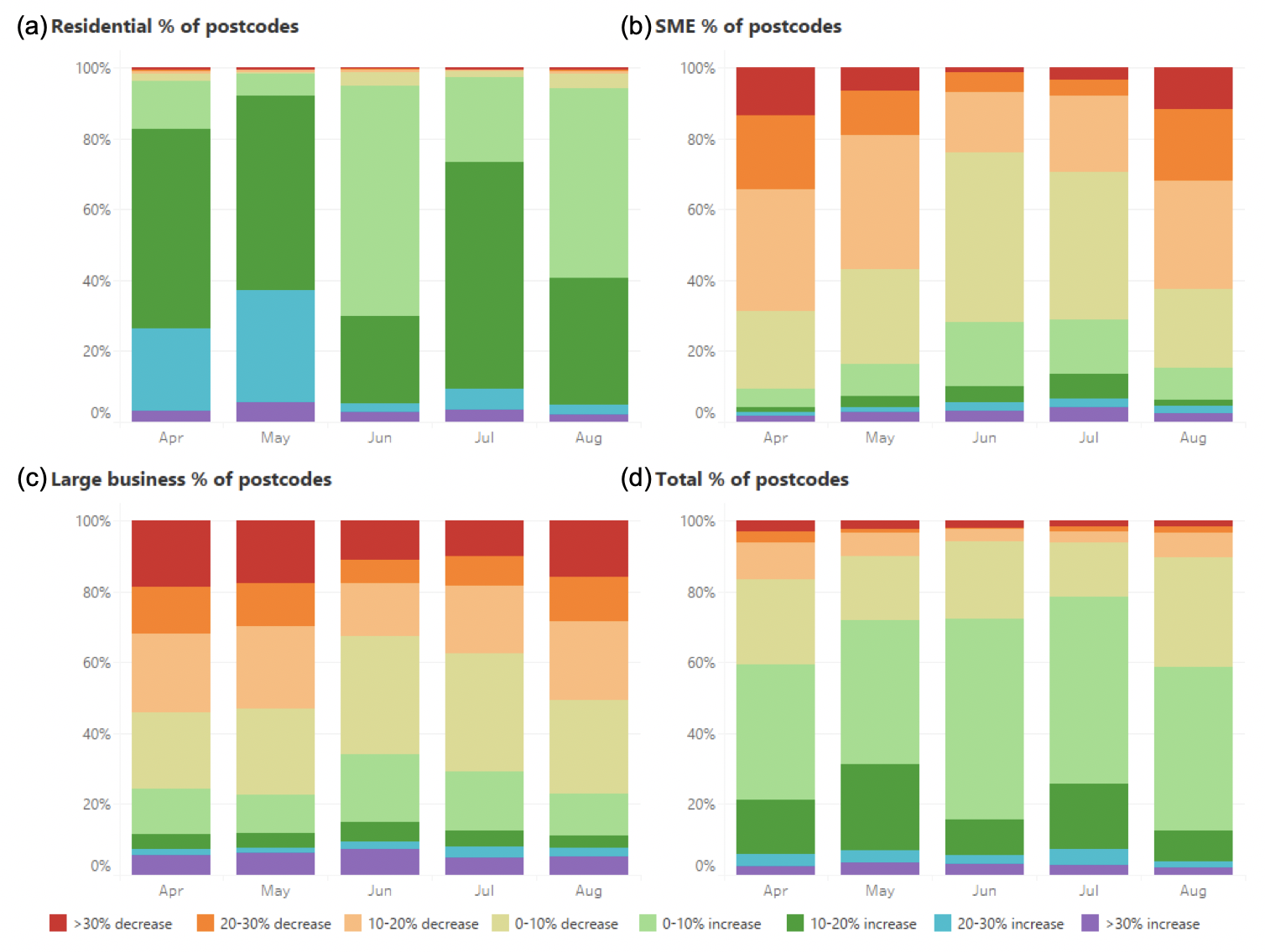
Figure 4: Monthly distribution changes in consumption from April to August 2020
Figure 4 illustrates the monthly distribution of changes in consumption from April to August for three different segments: residential (panel a), small-medium enterprises (SME, panel b)) and large businesses (panel c). Total consumption for Victoria is also shown in panel d.
Each bar shows the percentage of postcodes, for that consumer category, that experienced a particular percentage increase or decrease in demand compared with the consumption in the same month in 2019 (no correction for weather). The “warmer” colours (red and orange) indicate a decrease in consumption, while green, blue and purple indicate an increase.
Figure 4 charts the coming and going of restrictions in Victoria. The relaxation of restrictions in June can be seen, with a drop in residential consumption and an increase in SME and large business consumption. However, the reintroduction of Stage 3 (July 9) and the start of stage 4 restrictions (August 2) saw a return to increased residential consumption, but not to the same levels as in March and April.
A significant decrease in SME consumption can be seen in July and August (figure 4, panel b), where 75 per cent of postcodes showed a decrease in July, increasing to 85 per cent of postcodes in August. The overall impact on SMEs in August was not as severe as in April, but in August the decrease was concentrated on the Melbourne CBD.
This impact on the CBD and surrounding areas can be seen when comparing the Melbourne April 2020 postcode map (figure 5) with the August 2020 map (figure 6). There are many more red (>30 per cent decrease) and orange (20-30 per cent decrease) postcodes in August.
Similarly, large business demand was decreased by more than 30 per cent in 10 per cent of the postcodes in July and in 17 per cent of postcodes in August.
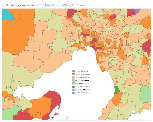
Figure 5: Changes in SME consumption in April 2020 vs April 2019
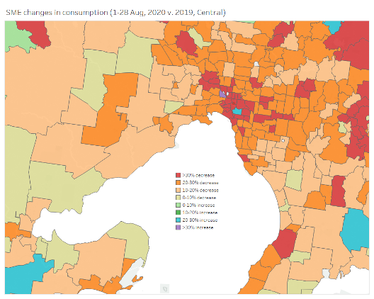
Figure 6: Changes in SME consumption on 1-28 August 2020 vs 1-28 August 2019
Overall, in Victoria, total consumption, (figure 4, panel d) increased in almost 80 per cent of all postcodes and is also shown in figure 7, where most areas show an increase in consumption of between zero and 20 per cent.
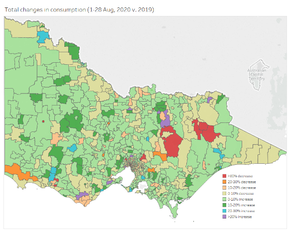
Figure 7: Changes in total consumption on 1-28 August 2020 vs 1-28 August 2019
Jemena recently published a report which details the astonishing 50 billion energy consumption data points it has collected over the ten years of the smart meter program. That’s 5 billion a year, for just one of the distribution networks in Victoria.
As the charts and maps show, this data is very rich and provides key insights into not only how and when consumers use electricity, but also allows support to be targeted at consumers who need it most.
This analysis of consumption is based on raw, unaudited data. In some cases, gaps exist, which may cause comparisons of consumption between 2019 and 2020 in smaller postcodes to be less accurate. Again, all the maps and analysis in this article are illustrative and should not be used as a basis for decision making.
Acknowledgements
Energy Networks Australia would like to acknowledge the Victorian DNSPs which have shared their data during the COVID-19 pandemic and have provided these maps.
")

